
- Home
- About
- Service
Web Design
Web Development
SEO & Marketing
- Our Portfolio
- Our Package
- Blog
- Contact
- Home
- About
- Service
Web Design
Web Development
SEO & Marketing
- Our Portfolio
- Our Package
- Blog
- Contact
We recognise how crucial it is to have a website that provides an outstanding user experience across a range of screen sizes in a world where mobile devices are the norm. As a result, we provide responsive web design services that are customised to match your user’s requirements.
WebTechNet Pro is one of the best places to get responsive website design services. From a user-experience standpoint, we understand how important and successful responsive website design is for your website. We have worked with companies in various industries to create websites that accurately reflect their online platforms. Partnering with us, you can get a website that works seamlessly across devices and screens. We promise to deliver an outstanding user experience so your users will continue to engage with your website.
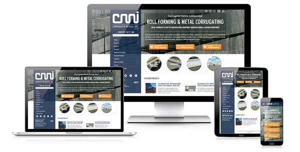
What drives the engagement of the website? A smooth and responsive website. In today’s mobile-first world, your website needs to provide the same experience to users as they change from mobile to iPad, laptop or desktop screens. Your users will not feel any change in experience as they switch from one device to another. With our responsive website design service, you can give your users the ultimate smooth website experience. The scope of responsive website design extends beyond cross-browsers and multiple screens. Our website design works flawlessly on all browsers, regardless of the type of browser your users are using. The same seamless user experience will be provided to your website visitors.

We would love to hear about your upcoming website project
Samrat Roy, WebTechnetPro Director
WebTechNet Pro is your one-stop shop solution for responsive website design. We have helped businesses build responsive websites, which has translated into creating online profit. We have a team of the best website designers and developers who are known for creating websites that are not just visually stunning but also work efficiently across devices. When creating your website, our designers prioritise mobile devices. This is due to the fact that mobile devices are now used to access the majority of websites. As a result, we recognise the significance of having a mobile-responsive website. Our designers at WebTechNet Pro understand this. We test your website across multiple devices to ensure it is flawlessly responsive on all screens. Our website designers are performing cross-browser tests to ensure your website works seamlessly across multiple browsers. Therefore, your website users will be able to enjoy a smooth experience across different websites.
Hiring us as your responsive website design service partner will cost you less. We understand our client's budgetary constraints and provide quality solutions that don't overshoot their budget.
We are known for providing exceptional responsive website service. Our website will work seamlessly across different interfaces, from Apple to Android or Mac to Windows.
Our credibility is amply demonstrated by our experience. The skilled team has spent a lot of time perfecting their craft. Our designers are constantly ahead of the curve and understand what will best meet your needs.
We create responsive websites for you at a price that maximises your return on investment so you can begin making a profit from the get-go. One of our main objectives from the start has been to use your website to help your business make money.
Glitches can appear, but that shouldn't halt your business operations. To address & resolve such issues, we provide 24/7 support. If you experience any problems with website responsiveness, you can reach out to our team at any time.
There is no straight answer to this. It depends on your website requirements. You can get in touch with us to get a free quote.
We have a highly efficient team of website designers who are ready to get to work. Usually, we take around 20 business days to get the site done. However, depending on the scale of the project, the timeline can differ. For a more realistic understanding, please get in touch with us.
Yes, your website will be compatible with all mobile screens. In a mobile-first world, it is important to have your website compatible with mobile screens. Be it an Apple or Android phone, your website will be compatible with all mobile screens.
Yes, your website will be compatible with different browsers. Your website will be compatible with different browsers. Your website will look the same across different browsers.
No matter which type of device you are using, mobile, iPad, laptop or desktop. Your website will look the same across devices. Your visitors will have the same user experience no matter what kind of device they use to browse your website.